Hackathon Case Study
Project Brief: Our team was given the task of developing a mobile or desktop experience that addresses a social cause that is important to us. The speculative project duration being a hackathon was only 2 days long.
My Role: UX Researcher & UX/UI Designer
Duration: 3/28/22 - 3/30/22
My Team: Mason Materna, Pierce Reid, Andrea Huang, Suparna Nahar, Fathima Anis
Tools: Figma, Slack, Google Office, Microsoft Suite, Photoshop,
Methodologies: Competitive & Comparative Analysis, Problem & How Might We Statements, User Flows, Design Studio, Sketching, Moscow Method, Wireframming, Rapid Prototyping, Usability Testing
Project Index:
Defining Our Path
Choosing Our Cause
With only two days to complete this project, we started by taking some time to brainstorm social causes that were meaningful to each of us and decide collectively which cause to try to tackle. After all sharing possible ideas, as a team we decided that since it was meaningful to a all of us and something we all felt strongly about, looking at helping to address food insecurities was the route we were going to take.
Once we had figured out the social issue we wanted to try to tackle, our next priority was to develop a project plan to figure out the key steps & processes we needed to take to accomplish the most and produce the best most comprehensive work we could in the short project window as well as how to divide up the workload to accomplish the most in the shortest amount of time.
Fortunately, in my senior year of University (2021) I completed a multiple month long anthropological literature review pertaining to food insecurities affecting minority communities in Chicago, and the external sociopolitical factors that perpetuate this injustice amongst these residents. With this extensive research being conducted very recently, and the shared sentiment amongst our team that conducting interviews in this context did not seem ethical, we used this compiled research as our basis moving forward.
Defining Our Problem
After discussing as a team ways we felt an app or website could help address this issue, we decided to develop a hypothetical mobile experience which partnered with the Greater Chicago Food Depository, a functioning hub for a network of more than 700 food pantries, soup kitchens, shelters and other programs to provide necessary resources to the community members of Cook County.
After deciding we wanted to develop an experience to aid the amazing work of the Greater Chicago Food Depository, we looked to address our key problem and ideate solutions through the development of a problem and how might we statement.
Problem Statement: Food insecure Chicago community members do not have adequate access to nutritionally sufficient food sources which can negatively impact their lives in a myriad of ways.
How Might We:
Assist in providing information on consistent nutritional food access to low income communities in Chicago?
Facilitate community engagement, addressing food insecurities?
Research Phase
Due to the extremely short project window, the robust base of research from the literature review, and the ethical consideration of not wanting to interview “potential users” we decided to supplement our research in the form of a competitive & comparative analysis.
Looking at the companies Meals On Wheels as a competitor & Too Good To go as a comparator, we created a feature inventory to assess the services and intricacies offered by these two companies to help guide our design decisions and better ideate how we could develop a useful resource to aid the Greater Chicago Food Depository.
Key Takeaways
G.C.F.D does not offer any options for delivery of meals
There is no ability to have any sort of membership with the G.C.F.D
The G.C.F.D offers more resources than strictly food resources
The type of food resource provided by the G.C.F.D is contingent on the type of pantry/shelter they are coordinating with at that location
User Flows
As mentioned before, with no user research conducted, as a team we moved forward and started developing user flows with our research data in mind, to flesh out the paths for both users that would interact with the the app.
With the Greater Chicago Food Depository serving as a middle man, we developed two user flows, one to represent how an individual looking for food resources would use an app like this, and a second to emulate the ways in which an administrator or stocker at that specific location would interact with an app of this nature.
User Facing Flow
Key Process Points
Available filters to narrow and prioritize the returned resource locations to fit exactly what the user is looking for
The ability to turn on push notifications to avoid the possibility of traveling to a location only for their resources to be depleted
Real time inventory updates to give the user as accurate a depiction as possible of the remaining resources
Admin Facing Flow
Key Process Points
Distributor needs to sign in via a location specific code or password to ensure security
The distributor inputs the available items at the beginning of the shift
Inventory is updated every hour at minimum
When inventory is completely depleted the distributor updates the status to notify all potential users
Design Phase
Sketching
With our user flows created, as a team we conducted a design studio to allow each team member to sketch out their ideas of what form they felt that this app would take following the steps along the admin facing & user facing user flows.
With all of our sketches blended and discussed, we chose to create two “feature prioritization” lists to ensure we could deliver a MVP by the end of the project window catering to the most essential needs for both the user & admin sides.
User Feature Priority List
User sign up without needing to enter anything more than a password & username
Map directions based on entered zip code or using the phones current location through Apple’s location services
Ability to toggle between “Map View” & “List View” for viewing returned locations
The ability to enable push notifications about status of a locations inventory
Admin Feature Priority List
Location specific sign in code or password to ensure security and prevent tampering
Ability to update resource status hourly at a minimum and more often if able
Visual representation of resource breakdown at the specific location
Wire Flows
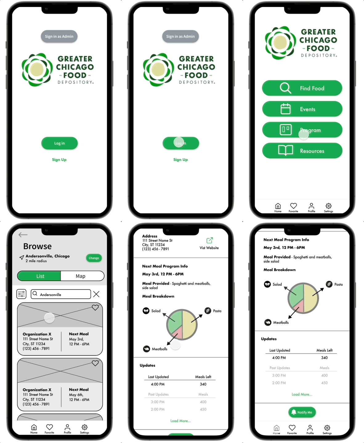
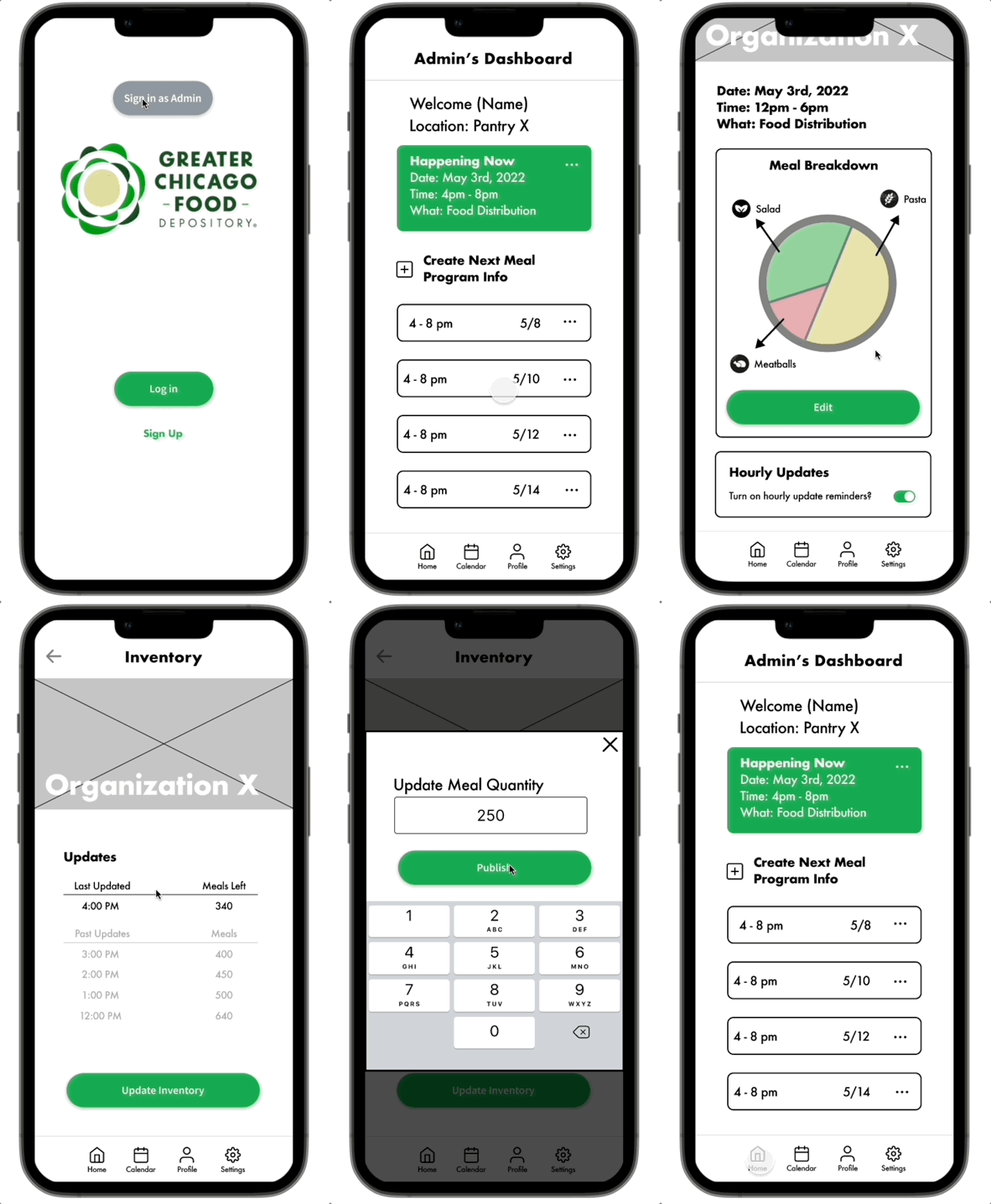
Moving forward with our MVP features in mind, we created a low-fidelity wireflow from our sketches for both the user facing and admin facing flows to visualize how each user would navigate through the app and how the UI could cater to the users goals.
We created these two separate wire flows in accordance with the created user flows for both the user and the admin that were displayed earlier.
User Facing Flow
Admin Facing Flow
Prototype & Testing
Mid-Fidelity Prototype
Using our low-fidelity wireflows, and understanding with our project window we would not have time to develop a high-fidelity prototype, as a team we developed a mid-fi working clickable prototype with our decided upon MVP features that allowed both user types (admin & food seeker) to navigate the app for their desired tasks.
User Facing Walkthrough
Admin Facing Walkthrough
Usability Testing Data
Even with a very expedited project window, we wanted to prioritize testing with users to validate our designs. We conducted 6 usability tests, and asked the users to accomplish one task embodying the users and one task embodying the admin.
User Task: As a user of this app you are looking to acquire food from a resource location with available inventory, can you please show me how you would do this?
Admin Task: As an admin, you need to sign into your location and provide an inventory update to the current shift, can you please show me how you would do this?
6/6 Users completed the task via direct or indirect success
Overall users accomplished the task with little trouble, but noted some visual choices that could lead to confusion
6/6 users tried clicking the “Map Pins” to view a location
Users noted they were confused as to what “Notify me” pertained to
6/6 users thought the food visualization chart was clickable from the user side though it was not
6/6 Users completed the task via direct or indirect success
Similarly to the user facing test, users were able to accomplish the task with minimal trouble but noted design choices that confused them
3/6 Users noted after the test that it was tough to distinguish between what was a clickable allowance and what was not
Users noted the green box for “live hours” seemed more like a banner and did not strike them as a clickable button
Conclusion
Takeaways
Next Steps
With such a short project duration, we knew that our designs would not be perfect and would need further iterations and testing. As a team we ideated what our next steps would be if we had more time to work on this project.
User Facing Next Steps:
Add “distance relative-to-user” onto the organization cards
Flesh out the development of the filter system to cater to users specific preferences
A way to distinguish whether the location was providing meals or simply open for resource pickup
Implementing a survey/feedback system to aid updating peak hours and inform specific locations with user data
Admin Facing Next Steps
Reworking the “upcoming meals” section to clearly distinguish this from the currently live hours
Inclusion of a “peak hours” time table to provide provide details on the busiest time slots
Allowing for a customizable update time for inventory
Personalization for each type of service (ex. hot vs cold meals)
For resource pantries, develop a way to promote types of goods offered as opposed to updated inventory


